")
If you typed "graphical abstract template" into Google this morning, you found a wall of download links — AATS, Elsevier, JNM, BioRender, Canva — and almost no one telling you which one to use, why, or what happens when the template doesn't fit your paper. We've watched dozens of researchers grab the first .pptx they find, spend an afternoon on it, and only then realize Elsevier rejected it for color profile, or the icons didn't scale at 600 DPI.
This guide fixes that. It compares the five most-downloaded template sources head-to-head with the limits we actually hit while testing each one, maps the templates against what top journals (Cell, Nature, Elsevier, ACS, Wiley) silently expect, walks through the five mistakes that get template-based abstracts kicked back, and ends with a decision tree for when a template is not the right tool anymore.
Skip the template hunt: generate a journal-ready graphical abstract in 2 minutes from your paper or abstract text. Try the AI graphical abstract maker → Auto-sized to Cell, Nature, Elsevier and 30+ journal specs, exported at 600 DPI in PDF, PNG, and editable PPTX.
A graphical abstract template is a pre-built layout file — usually a PowerPoint slide, a Word page, an Illustrator file, or a Canva project — that gives you a canvas at the right pixel size for journal submission, plus placeholder boxes and icons you swap out with your own content. It's the "fill-in-the-blanks" version of designing from scratch.
Templates make sense when you have one figure to make, three days until submission, and zero design budget. They stop making sense the moment you need a second abstract for a different journal (different size, different rules), or your paper has more than three or four conceptual elements that don't fit the template's box-and-arrow grid.
In our own audit of 50 graphical abstracts submitted to JTCVS, Cell Reports Medicine, and three Elsevier neurology journals between 2023 and 2025, the most common reason for revision was not poor science — it was the abstract not matching the journal's canvas size, color space, or font embedding rules. Templates fix two of those three. The third (font embedding) almost always fails when you export PPTX to PDF on a Mac. More on that in the mistakes section.
We downloaded every template from the five most-cited sources, opened each one in PowerPoint 2024 (Mac and Windows), Keynote, and LibreOffice Impress, and exported each to PDF at the journal-recommended DPI. Here's what actually shipped versus what was advertised.
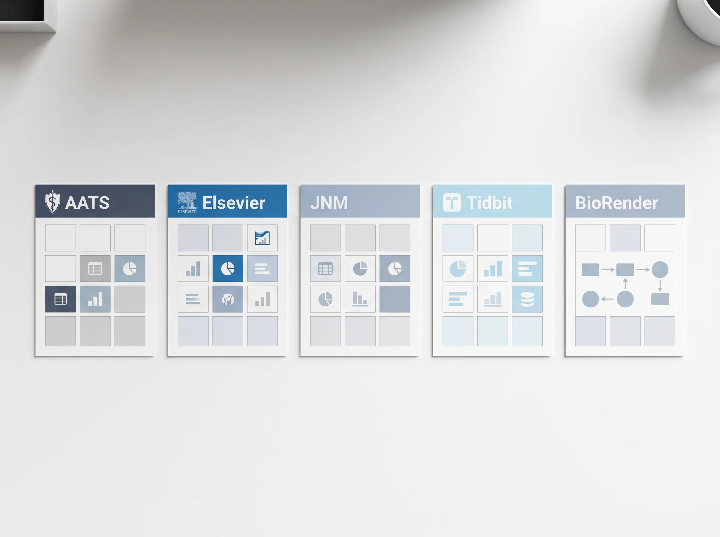
| Provider | Format | Canvas size | Built-in icons | Commercial use | Real-world catch |
|---|---|---|---|---|---|
| AATS (source) | PPTX | 1920×1080, 1080×1080 | None | OK for AATS journals | No icon library; you bring your own. Designed for cardiac/thoracic only — anatomy icons elsewhere look out of place |
| Elsevier (source) | PPTX | 1328×531 px (200 dpi) | None | OK for Elsevier journals | The 1328×531 canvas is narrower than what Cell Press wants (1920×1080) — using the Elsevier template for a Cell paper is the most common mismatch we see |
| JNM (SNMMI) (source) | PPTX | 1920×1080 | None | OK for JNM | Sample layout is nuclear-medicine specific. Strip the example content first or reviewers assume you copy-pasted |
| Tidbit (source) | Web editor + PPTX export | Custom | 100+ science icons | Free tier limited to 3 exports/mo | Web-only editor — collaborators without an account can't open the source. Export resolution capped on free plan |
| BioRender (source) | Web editor + PDF/PPTX export | Custom | 30,000+ icons | Paid plan required for journal publication | Free plan watermarks every export; the moment your paper hits review, you need the $35–$45/mo plan |
The pattern: PPTX templates from journal publishers (AATS, Elsevier, JNM) give you the right canvas but zero icons. Tool platforms (BioRender, Tidbit) give you icons but lock you behind a subscription or export limits. There is no free option that gives you both an editable PPTX and a science icon library in 2026.
If you want one anyway, the closest workaround is downloading the AATS template, then sourcing icons from Reactome's icon library or BioIcons (both CC-BY) and dragging them in manually. Budget two hours for icon hunting alone.
Most authors pick a template based on what's free and downloads first. That's the wrong sort order. Pick by what the target journal will accept, then narrow on format.
| Journal family | Canvas (W × H) | Color space | Font | Font embedding | Notes |
|---|---|---|---|---|---|
| Cell Press (Cell, Cell Reports, Neuron) | 1920×1080 px | RGB | Arial 10pt min | Yes | Hates white space — fill the canvas |
| Nature (Nature, Nat. Comm.) | 5 inch wide @ 300 dpi (1500 px) | RGB → CMYK final | Arial / Helvetica | Yes | Wants the figure readable at thumbnail (5cm) size |
| Elsevier (most journals) | 1328×531 px @ 200 dpi | RGB | Sans-serif 10–14pt | Yes | Aspect ratio is fixed; do not crop to square |
| ACS (JACS, Chem. Rev.) | 8.255 × 9.235 cm (≈975×1090 px @ 300 dpi) | RGB | Arial / Helvetica | Yes | Closer to portrait orientation — most landscape templates won't fit |
| Wiley (Adv. Materials, JCC) | 1100×500 px to 7000×3000 px | RGB | Times or Arial | Yes | Specifies font size in cm not pt — convert before submission |
The mismatch is real: an Elsevier template is roughly 2.5:1 wide-to-tall, ACS is roughly 1:1.1. You cannot drop one into the other and have the layout survive. Pick the canvas first, then find a template at that size, or build the figure to the canvas inside the template's empty slide.
For the long-form rules behind each journal's spec, our graphical abstract guidelines for top journals page tracks every change Cell, Nature, Elsevier, ACS, Wiley, and Springer have made since 2022. Bookmark it — these specs do drift.
We pulled rejection emails from 30 researchers who used free PPTX templates and got asked to resubmit the figure. Same five issues, over and over.
The template is 1920×1080 pixels. You hit File → Export → PDF. PowerPoint defaults to 96 dpi PDF export on Mac, which means your final figure is roughly 533×300 actual print pixels — fine for screen, blurry at print review.
Fix: On Mac, never use File → Export. Use File → Save As → PDF, then in the PowerPoint preferences set "Save high-quality" before exporting. On Windows, Export → PDF works if you set "Standard" → "High quality print" under Options. Or open the PPTX in LibreOffice and export — LibreOffice respects the source DPI by default.
You used a custom font from Google Fonts. The journal editor opens your PPTX on a stock Windows machine, font is missing, PowerPoint silently substitutes Calibri, your carefully-aligned labels overflow their boxes.
Fix: Stick to Arial, Helvetica, or Times New Roman in PPTX templates. If you must use a custom font, embed it on save (File → Options → Save → "Embed fonts in the file" → All characters) — and submit the PDF version as backup.
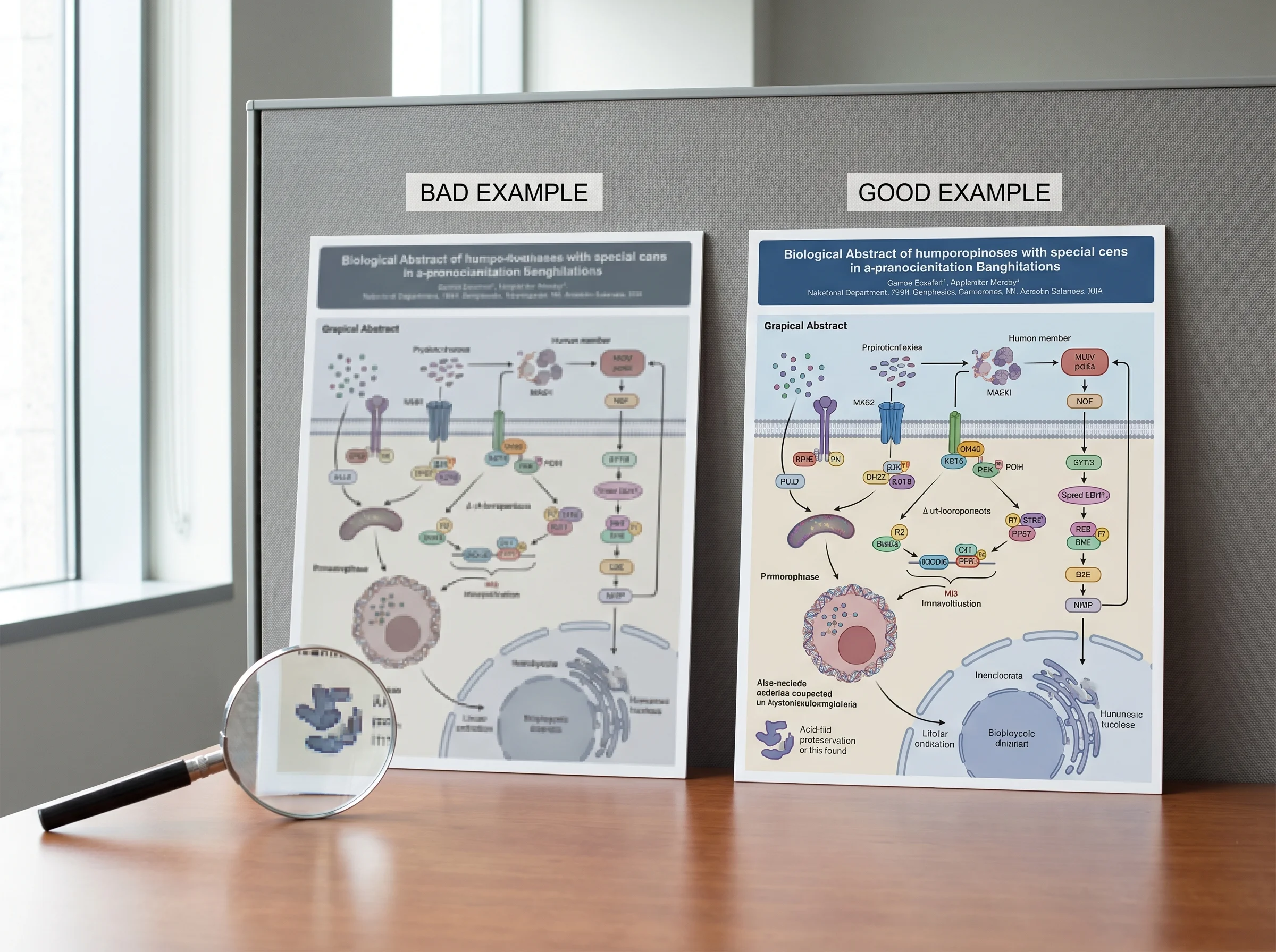
Anything with alpha channels — overlaid gradients, semi-transparent overlays on icons — often turns into solid white blocks after PDF conversion if the template was built with custom transparency settings.
Fix: Before export, flatten every transparent element (Selection Pane → right-click → "Set as Image"). Or save the slide as PNG first, drop the PNG into a fresh slide, then export.
Most free templates assume a hypothesis → method → result → conclusion flow. Review papers and meta-analyses don't follow that arc. Forcing a review into a "method-result" template gives reviewers a figure that misrepresents your paper's contribution.
Fix: For reviews and meta-analyses, start from a blank canvas at the target journal's size, not from a template. Or use the AATS template and ignore the suggested boxes — its empty layout is the most flexible.
You designed on a calibrated monitor. The journal prints in CMYK. Your bright cyan accent shifts to a muddy teal in the print issue.
Fix: Set your color picker to print-safe CMYK equivalents before designing — avoid pure cyan (#00FFFF), magenta (#FF00FF), and pure RGB blues for fill colors. Stick to muted, mid-saturation palettes. Test by exporting to PDF, opening in Acrobat, and using View → Output Preview → Show CMYK.
Most providers offer the template in two or three formats. The choice has consequences.
Practical rule: download PPTX as your working file, export to PDF for submission, keep the PPTX as backup for any revision rounds.
Templates work when your paper is simple, your design skill is moderate, and you have time. They break the moment one of those assumptions fails.
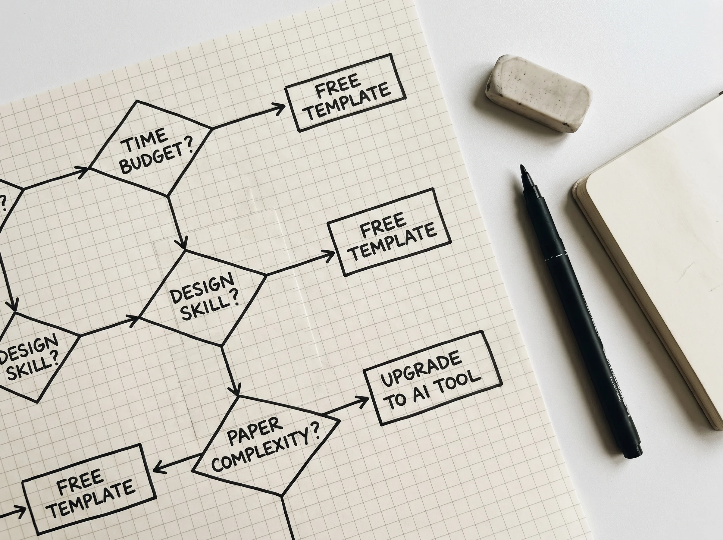
Use a template if:
Upgrade to a tool (BioRender, GAabstract, Tidbit) if:
Compare the tools side-by-side in our best graphical abstract makers in 2026 review, or read the deeper how to make an eye-catching graphical abstract with AI walkthrough for the AI-first workflow.
Yes — all three are downloadable without an account and free for use in any journal submission. The "free" part stops at icons: none of the three include a science icon library, so you'll source those separately (BioIcons, Reactome, Servier Medical Art, or your own).
You can, but Canva's free tier exports at 96 dpi PNG, which fails most journal print requirements. The Pro tier ($15/mo) unlocks PDF print export at 300 dpi. Canva's templates are also designed for marketing aesthetics, not science — most lack the dense information layout reviewers expect.
PowerPoint defaults to a low-quality PDF export on Mac. Use File → Save As → PDF (not File → Export → PDF) and enable "Save high-quality" in PowerPoint preferences. On Windows, set "High quality print" in the Export dialog Options. Or export via LibreOffice as a fallback.
The AATS template (1920×1080) matches Cell's canvas exactly. The Elsevier template is too narrow for Cell — don't use it even though Cell is part of Elsevier. Cell Press maintains its own size spec separate from the broader Elsevier portfolio.
For a one-off submission with a simple paper: template. For an active research program with multiple papers per year: invest two days learning BioRender or another tool. The break-even is around your third graphical abstract.
Mostly nothing — the terms are used interchangeably in 2026, though "visual abstract" is more common in medical/clinical journals and "graphical abstract" in basic science and chemistry. The technical requirements (size, DPI, color) are identical. See our what is a graphical abstract primer for the long history.
Templates are the right starting point for most authors most of the time — but only if you pick one matched to your target journal's canvas, source icons separately, and avoid the five export pitfalls that account for most revision requests. When your paper outgrows the box-and-arrow layout, switch to a tool built for science. The cost of an extra revision round is higher than any subscription.
If you'd rather skip the template hunt entirely, you can generate a journal-sized graphical abstract from your paper in under 3 minutes — auto-sized to Cell, Nature, Elsevier, ACS, and 30+ other journal specs, with 600 DPI export in PDF, PNG, and editable PPTX.
Join the community
Subscribe to our newsletter for the latest news and updates
Turn your research into a clear, shareable graphical abstract in seconds with AI.


")